~ 11 min
Geospatial Data as Evidence
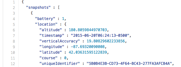
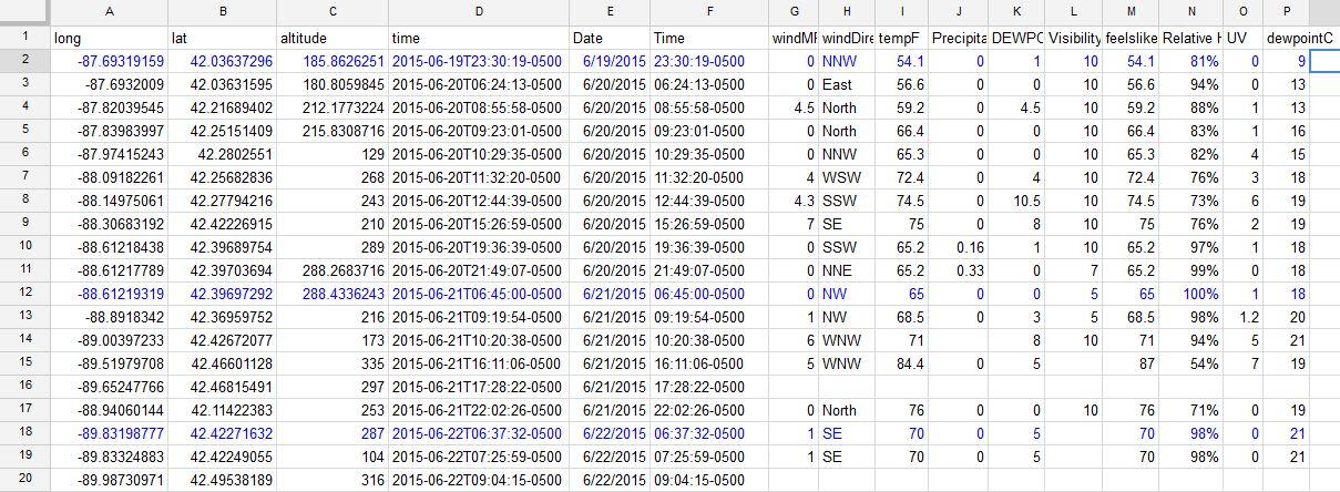
The geospatial data for this project was collected using Nicholas Felton’s cell phone application, Reporter.(1) The app aggregates the data that a cell phone usually collects for a set number of times a day. Using the application on this 48 day trip across the nation, I tracked our location and weather. The app collects this information and can batch export the days’ report from phone to cloud storage space in a .json file. I then hand culled the types of data that would be most interesting for the consideration of geospatial analysis. Figure 1 shows a simplified .csv file with the data I deemed relevant to this mode of questioning.
Figure 1
There are many other data points ambiently collected via the Reporter application, battery power level, audio level of a given space, number of photos taken as well as technical specs about those photos, their brightness and exposure. While these data may be interesting to consider in future projects I wanted to focus on data that could be spatially analyzed due to the mobile aspect of the project. All of my raw .json files from the time of the journey are available online for download and experimentation (I invite the reader to take my data sets and reinterpret them in new unexpected ways).(2) There are many additional questions that could be asked of the data collected on this journey. For this project I had to choose a mode of questioning in order to begin an investigation of my data. As I sifted through the raw data I thought the sound and photo information was interesting but might not have any patterned relationship to my location. As I considered the memories of the trip in the photos and the journals collected, I decided to focus on the weather data. I wanted to see if a real quantitative reading of my weather data could raise some interesting findings about our travels that I may not have been able to extrapolate in other ways. When stepping into GIS analysis it is imperative to consider that “Simple maps may be easy to make and interpret on their face value, but GIS further enables quantitative and statistically-based measurements of the relationships among data sets.”(3) A considered quantitative reading of my data would require a statistical comparison.
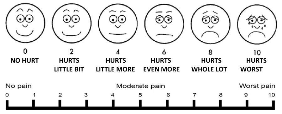
I then reformatted the data I would use from my .json file, turned it into a .csv with only the data I intended to consider,(4) and worked to make my data readable in ‘ArcMap,’ an ‘ArcGis’ tool made by Esri.(5) The program builds maps and provides statistical tools so that the user may interpret their map’s relational data as well as their spatial position. Once the data was compiled and read accurately into ‘ArcMap’ I began to consider how I was going to question the material. I decided to create personal index as a standard of measurement to weigh the weather data against. Using a basic pain index scale pictured in Figure 2, I sifted through all of my daily journals and rated my pain scale for every day of the trip.
Figure 2
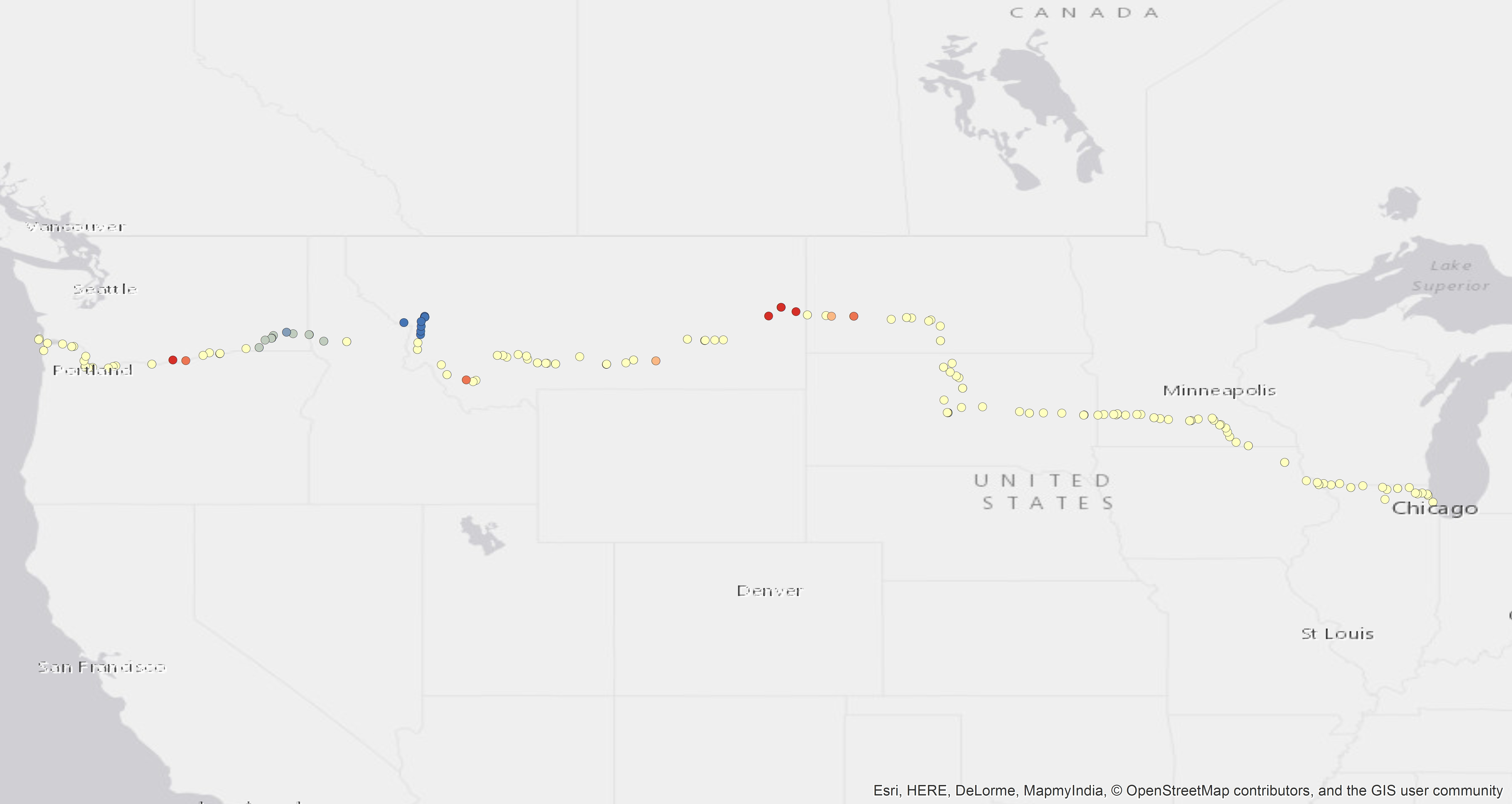
The next step was to take a look at the general patterns found in the weather data. I used a ‘HotSpot’ analysis, specifically the “Hot Spot Analysis (Getis-Ord Gi) (Spatial Statistics) (Tool)”. In ArcMap, “The Hot Spot Analysis tool calculates the Getis-Ord Gi statistic for each feature in a dataset. The resultant Z score tells you where features with either high or low values cluster spatially.”(6) I then made a ‘hot spot’ map for each one of my weather variables. This gave me the ability to see the basic trends in my data. I then used the “Ordinary Least Squares (OLS) (Spatial Statistics) (Tool)”(7) to compare each of the weather variables against the happiness index. The following Figures 3-7 show the ‘Hotspot’ map for each one of the weather variables considered.
Figure 3 altitude hotspot
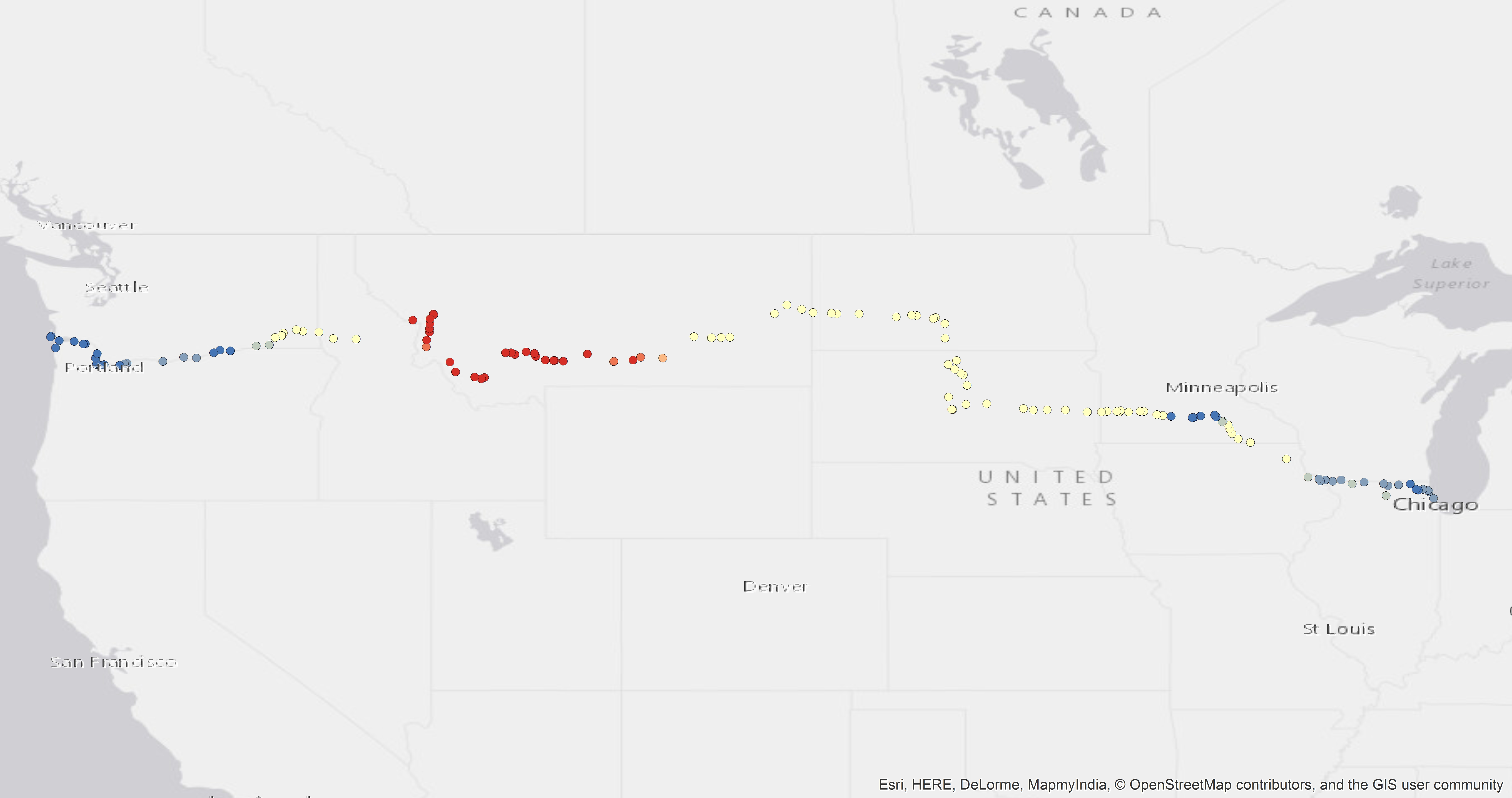
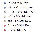
Figure 4 relative humidity hotspot
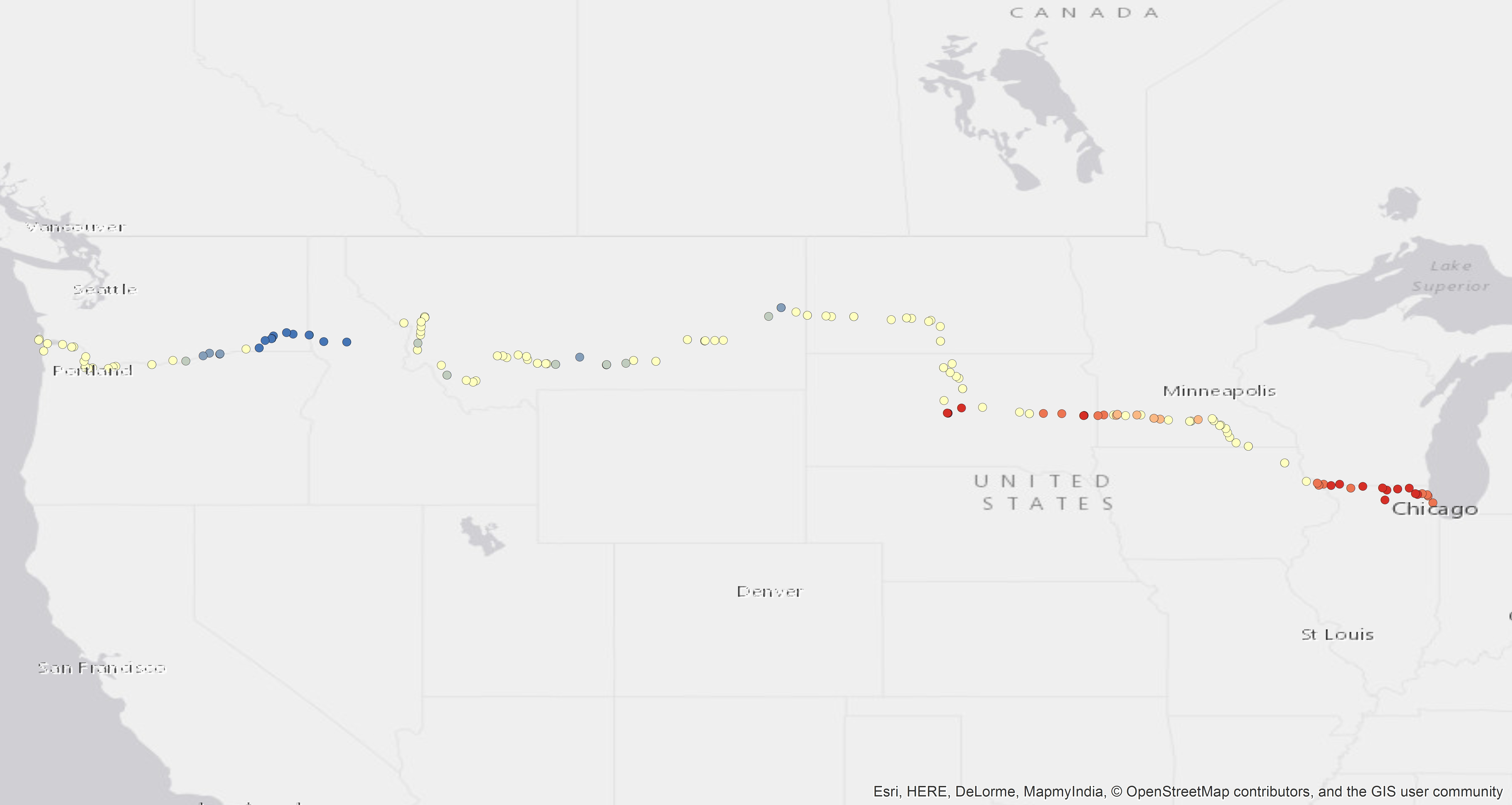
Figure 5 temperature in fahrenheit hotspot
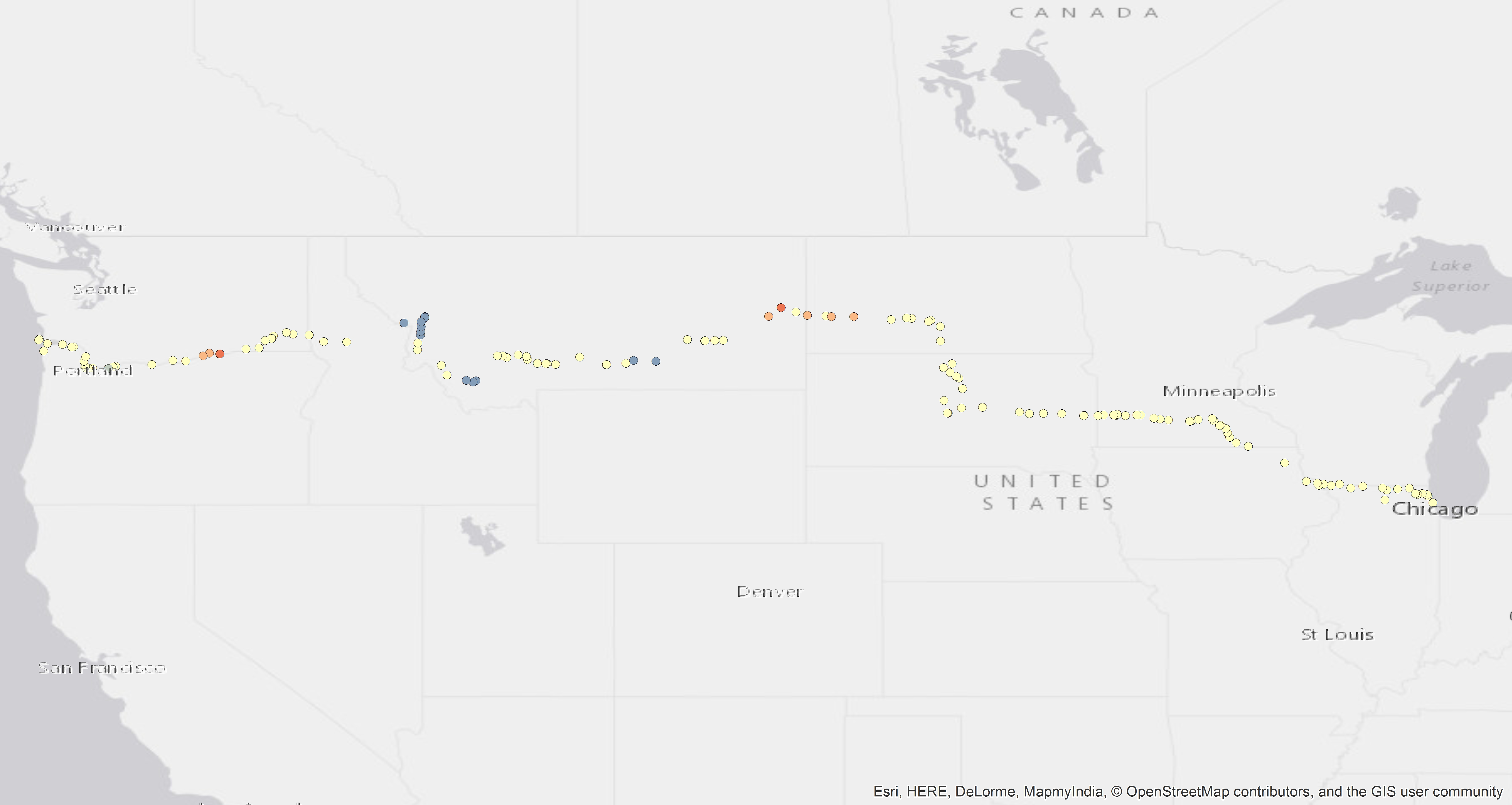
Figure 6 UV index hotspot
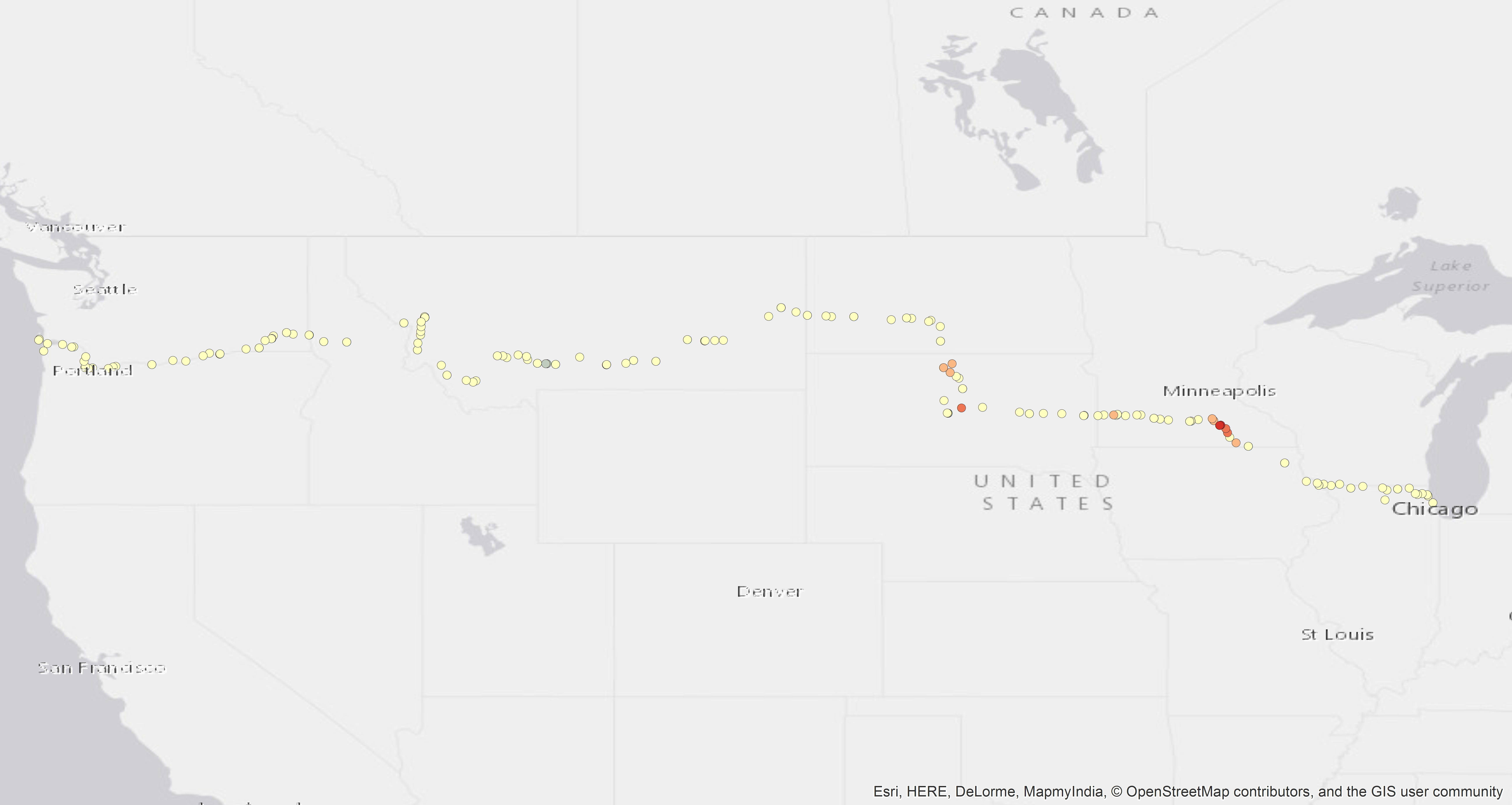
Figure 7 windspeed mph hotspot
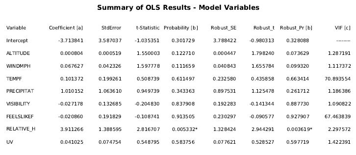
On close inspection of the OLS report and considering all the weather variables with relation to happiness, the only significant weather data that that affected happiness was relative humidity. The two asterisks in the chart below Figure 8 show the results of the OLS test. I then took the OLS relative humidity layer and pulled it into Google Earth to consider a street view look at the positive significance and negative significance of the OLS report. This required me to convert the OLS map to a .KML layer using the kml conversion tool in ArcMap.
Figure 8
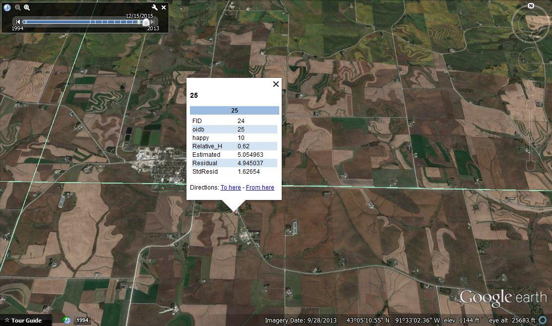
The OLS Variables (altitude, wind, temp, visibility, UV, and relative humidity) relative to Happiness layer pulled into Google Earth. The first series reveals the correlation between relative humidity and happiness as we travelled to Postville, Iowa shown in Figure 9.
Figure 9
Relative humidity being highly positive in relation to happiness index
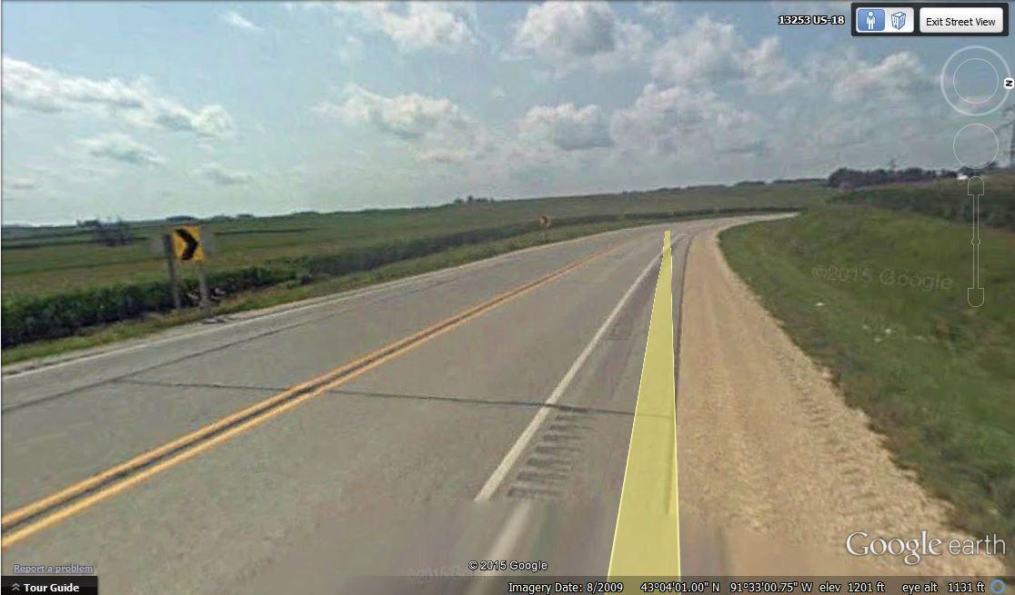
This street view in Figure 10 may look insignificant but I immediately recognized it. This image documents the moment I was coming into Postville after a fourteen hour day of riding with terrible road conditions all day. Although this road is paved, you can see the large rumble strip on the side and a six-inch shoulder to the left of it. This road had huge trucks flying down the highway and very little room to travel on a bike. This was one of the toughest physical and mental days biking for many reasons, but in retrospect it makes sense that the humidity index was also exceptionally high. This Google Earth capture of my data point infuses the landscape and memory with a retroactive experience. While the Google Earth spot brings up a memory, I have now taken that memory and given it statistical significance by layering a numerical emotional correlation onto this very spot.
Figure 10 Street view from Figure 9
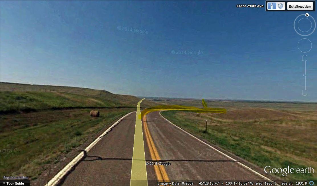
The next highly significant hotspot of relative humidity in relation to happiness was outside of the town Mobridge, South Dakota. The Google Earth pinpoint is pictured below in Figure 11. The street views show the route into Mobridge. The road has cracks and the shoulder and is only about six inches wide on either side. There is no tree cover or protection from the heat. In the street view I have highlighted the road shift in elevation in Figure 12. The vertical climb into Mobridge, South Dakota was incredibly strenuous. Although I remember it was hot it again makes complete sense that the humidity index would add increased hardship for travel this day. Again this data point is given legitimacy by the spatial memory recorded in a numerical value and then remapped into the geographic location.
Figure 11 Mobridge, South Dakota
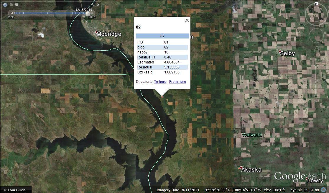
Figure 12 Street view from Figure 11
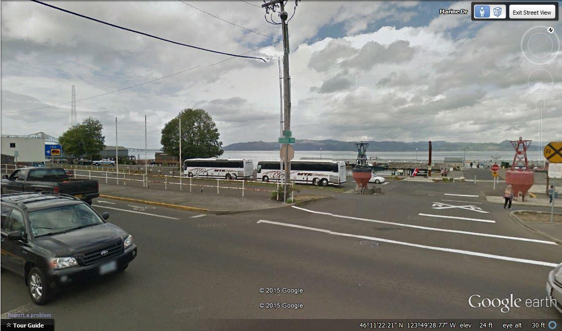
I also considered a ‘cold spot’ on the OLS report concerning humidity with respect to happiness. One of the cold spots was a data point taken in Astoria, Washington, seen in Figure 13. The street view reveals a variety of positive influences. There is open water in sight and I remember the breeze being welcoming here. One can also make out a bike path on the right side of the road. We were in a beautiful small town and around the corner from us was a conveniently located coffee shop/sandwich shop and incidentally we were on the last day of our trip. Figure 14 shows the street view pictured below. There are things that I remember about this space that are now re-affirmed by my quantitative analysis. The measurement allows me to consider the memory in a pointed way that is contained within the numerical reading of the space.
Figure 13
Astoria, Washington. ‘Cold spot’ on the OLS report concerning humidity with respect to Happiness.
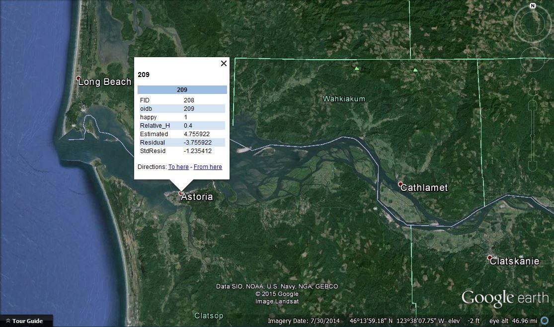
Figure 14 Street view from Figure 13
It was disappointing to realize that most of my weather data was not more specifically correlated to my happiness index. This close investigation at the quantitative data collected on my trip shed a new light on the holes in my data. There are significant times when the information I collected did not reflect the first hand experience of my day travelling. I wonder if a more accurate consideration of the elevation changes in a single day (a delta altitude variable) would have played more crucial part in my temperament in relation to the happiness index. My weather data took into account wind speed, but this iteration of the project did not consider the direction of the wind i.e. comparing a head wind to a trailing wind. Adding this dimension to the data might lead to more interesting conclusions or even change my results.
I have become more critically informed about the types of information I would attempt to collect about an experience to more specifically measure correlation between internal and external data. This project and analysis has allowed me to consider the more complex variables in relationship to the correlation between weather and altitude data in future projects. As I set up my Reporter application to record data I was unaware of the analytic methods I would use to interpret the data. I now know that it is important to make sure that each data point is collected at the same time every day. I now know that a numerical index for a qualitative experience (my happiness index) is very helpful when attempting to draw conclusions from first hand experiences. In the future I want to collect multiple experience indices numerically: a scale for body pain level, hunger, road condition, and emotional state. This way I would hope to find more specifically correlated information about myself in relation to the landscape and the conditions.
This analysis of quantitative data gave me a chance to look at measured numerical data we collected on this journey. It allowed me to view landscapes with a measured correlation of experience to natural conditions. If we consider Digital Humanities as a realm of scholarship that allows the researcher to engage with a body of information using analytical methods, this first section of analysis is a geospatial statistical reading of the memory of moving through a certain space. What do we remember about how we know the landscape? Is it purely a survival experience that is related to the environment? We traditionally measure weather, and in turn the landscape, by humidity, temperature, and elevation. These numbers placed into the landscape give us a meter with which to understand our hardships, the hill is high, the wind is fast, and the temperature is hot. These numbers require reading and consideration and while they measure something they do not hold the entirety of an experience. Their collection and their context is changed by the researcher’s mode of questioning and experience.
This first section of this project allowed me to consider the quantitative data I collected and the implications of their spatial statistical analysis. The next sections of this paper will consider ways to measure the qualitative data collected during this journey.
Footnotes
- Felton, Nicholas. “Reporter.” www.reporter-app.com, n.d. Web. 11 May 2015.
- Pollack, Julia. “Git Hub.” geospatial data Web. 6 April 2016.
- “Teaching Geographic Information Science and Technology in Higher Education” (1). 2011. Hoboken, GB: Wiley. Accessed April 7, 2016. ProQuest ebrary.
- Pollack, Julia. “Git Hub.” https://github.com/julia-pollack/julia-pollack.github.io/blob/master/assets/geospacial/summer2015.csv Web. 6 April 2016.
- “ArcMap” Esri, http://desktop.arcgis.com/en/arcmap/ Web. 6 April 2016.
- “How Hot Spot Analysis: Getis-Ord Gi* (Spatial Statistics) works” Esri, Web. 6 April 2016.
- “Ordinary Least Squares (OLS) (Spatial Statistics) (Tool)” Esri, http://pro.arcgis.com/en/pro-app/tool-reference/spatial-statistics/ordinary-least-squares.htm Web. 6 April 2016.